The Way Customers Think

Potential customers come to a website to achieve a specific goal. The thought process for the way a person goes about this is the same for everyone. You can create a more effective and user friendly site, page, or user flow by understanding the way a customer thinks when viewing your website.

People Have ‘Real-Time’ Needs

People’s attention focuses almost completely on the task at hand. Things that fall outside of this goal will be ignored.

People do not want to be taken on a wild goose chase when looking to complete a task. As such, marketing messages that are thrown in front of a person will be missed unless they specifically address the ‘real-time’ need.

Think about the needs of the people coming to your site in the first place and then create areas that will guide them closer to task completion.

Example of the Customer Thought Process

Take at look at the following example of a person who needs to buy an airline ticket to an April conference in Phoenix, AZ.

Diagram of the customer thought process when viewing a website

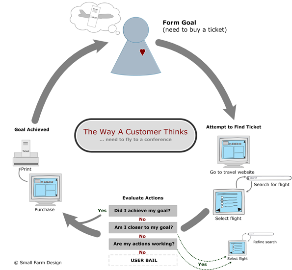
Diagram of the customer thought process when viewing a website. Download printable version (pdf).

Goal: Purchase a ticket to Phoenix

Step 1: Go to travel website (i.e. Orbitz, Travelocity, etc.)

Step 2: Enter location and date. Search.

Step 3: View flight options – Refine – View Again

Step 4: Purchase Ticket

Step 5: Receive Confirmation / Print Ticket

Since the person is looking for tickets to a specific location (Phoenix) during a specific time period (April) any messages being displayed that aren’t relevant to these two facts are going to be ignored. If on the other hand the person was casually looking for a trip to an unspecified location then the messages about quick getaways or airfare deals will have more relevance.

It is important to realize, however, that most visitors are coming to a site with a very specific goal in mind and anything that is perceived as irrelevant to completing that goal will be ignored.

Understanding what the human thought process is (first establish goal, next take actions, then evaluate result) as well as understanding why people are coming to your website will help you create a site that is more useful, usable and effective.

If you would like help finding ways to make your website better match how customers think drop me a line or check out the website review service.

Does Your Homepage Leave a Lasting Impression

Find out what kind of impression your homepage is leaving. Evaluate your homepage now.

First impressions count and online they count for a lot. The homepage is what is seen by many visitors when first arriving at a website. This initial impression will lead to either a lasting positive or negative impression that will affect their decision to continue using your site.

The most important aspect to be aware of is the goals of the site, and in this case the homepage. Having a grasp of what the visitor is trying to accomplish is key to getting the design right.

Designing a homepage is as much a science as it is an art form. It requires attention to detail, putting focus in the site’s purpose and goals, and taking into account the tasks the visitor wants to complete.

How does your current homepage rate?

You can get a better understanding of what is and what isn’t working on your current homepage in about 5 minutes. By taking the evaluation you should also gain insight into some best practice homepage design principles and ideas on how to improve your current homepage.

Get Started

Take the 5 minute homepage evaluation and see the kind of impression your homepage is leaving.


8 Common Sense Usability Ideas

When it comes right down to it usability design is a lot of common sense stuff. Sure, someone with experience conducting usability tests, writing personas, or designing information architectures has a deeper understanding of underlying usability issues, but a lot can be said for common sense.

Here a 8 common sense ideas to help you improve the usability of your website.

  1. Don’t make visitors think
    Steve Krug’s original law of usability (Don’t Make Users Think). Upon arriving at your website the visitor should be able to understand the page and know what they are being asked to do without thinking. If a visitor has to spend time thinking about how to accomplish their task that is time they are not spending completing the task, which is why they came to your site to begin with.
  2. Don’t make visitors feel stupid
    Error messages are some of the worst offenders of making visitors feel stupid. Your site should be designed to help the visitor avoid as many mistakes and errors as possible. However, it is impossible to avoid all errors. When errors happen the messages that are displayed should be helpful and useful so the visitor can quickly resolve the issue and move on.
  3. Make it easy to get help during the final stages of the buying process
    Look for ways to answer your visitors’ questions at critical decision points. For example provide answers to common questions, such as ‘What is your return policy’, or ‘do you offer any guarantee’, or ‘what are the shipping costs’ when the user is checking out.
  4. Eliminate Text
    Studies have shown visitors don’t read website content instead they scan the page looking for ‘trigger words’ (words that trigger a click) that are relevant to them. Look for ways to eliminate filler text. Review your current site copy looking for ways to reduce any copy that doesn’t add value to your message. Be aggressive. Then with the remaining copy use headlines, bullets and call-outs to make your page easier to scan.
  5. Don’t use silly link names
    Visitors arrive at your site to complete a specific task. They don’t have time, and don’t want to learn your terminology. Call things what they are and don’t force users to guess at what link name might mean.
  6. Write links with clear direction
    When writing you links, keep your link text simple and clear. Links should be descriptive and lead the visitor to the next destination, properly setting their expectation.
  7. Avoid using pop-up windows
    Pop-up windows remove user control, are disruptive and eliminate the ability to use the browser’s navigation (i.e. back and forward buttons). In addition, the content within the pop-up is not easily printed and often times pop-ups are blocked by modern browers’ pop-up blockers.
  8. Make it easy for visitors to contact you
    If visitors do want to get in touch with you, but can’t find your contact information, you lose their interest and trust. Your contact information including phone number(s) should be visible and not hidden. This becomes especially important if you aren’t selling online but instead using your site to provide information to your visitors that in turn will cause them to call or email for more information.

Small usability changes have been shown to have a large impact on key performance indicators. Addressing these eight common sense issue will help your website and give you an advantage over your competitors.

If you would like help understanding if your website project has fallen victim to any of these usability myths gives us a call or drop us a line.

7 Usability Myths

Recently I gave a high level presentation to a group of product managers in which I spoke on the business benefits of usability. Part of the presentation focused on 7 usability myths that I’ve heard and experienced while on project teams. I thought it would be valuable to share those here as well.

I realize that this is an incomplete list but these 7 myths were highly relevant to the group I was presenting to.

Usability Myths

  1. Usability is Expensive
    Best practices call for spending 10% of a project budget for usability, which in itself doesn’t account for a lot. However, if your budget doesn’t even have 10%, user feedback can get even cheaper.

    Gorilla usability is cheap.

    Conducting a test can be easy as grabbing a someone sitting in the next cube and ask them to run through something with you. Or, head down to a local coffee shop ask a couple people to help you out and then give them a $25 gift card. The information you receive is well worth the $25 bucks.

  2. Slows Down Projects
    Done right, usability design will actually save time. However, it does need to be factored in from the start of the project.

    One of the major benefits of usability design is that you don’t waste time on features that your visitors don’t want or need. Early usability design techniques show you where to focus resources so that you can deliver a better product in the same amount of time.

    Usability can also save time by helping you quickly settle arguments in the development team. Most projects waste countless staff hours as highly paid business folks sit in meetings and argue over what users might want or what they might do under various circumstances. Usability design allows you to focus on the visitor and takes the guesswork out of requirements.

  3. More than 3 Clicks = Bail
    No study has shown this to be true.

    Users are trying to complete task and meet a goal. As long as they feel that each click moves them closer to their goals they will continue. (See Getting Confidence from Lincoln, UIE)

  4. Users Want to Read
    Your website visitors are pressed for time and are probably multitasking, they don’t have time to read in detail.

    The writing of your site must be simple, short and to the point. To achieve this goal, look to reduce the quantity of text by 50% in the first review and reduce it again by 50% in the second review. The content that remains must be clear and concise.

    Make use of headlines, sub-heads, lists, link text, etc.

  5. Website Issues Can Be Fixed With Instructions
    As stated above users don’t want to read. Instead users muddle through a site.

    Think about yourself, how often do you read before clicking or filling out a form? I would guess most of you start interacting then if you have an issue you’ll try again probably, still not reading.

    Instead of writing to solve problems design your website to be easy to learn and understand.

  6. Usability = UI Design
    Usability is much more than deciding where to place a button goes. Design plays an important role in the usability of a site but the site needs to function first.

    Design can help an ugly, but working, user flow. Design can’t help a broken user flow

  7. Usability Testing = Focus Groups
    Nope. These are two completely different things.

    Usability testing: focuses on the completion of tasks and ease of use. It is a 1 on 1 interaction between the facilitator and the participant. The primary question usability testing answers is: what will make the website easier to use?

    Focus groups: focuses more on feelings & opinions, the likes and dislikes. It is a group to 1 interaction between a group of participants and the facilitator. The primary question focus groups work to answer: what will motivation to a person to buy?

As I mentioned this is by no means is this an exhaustive list. It is instead a starting point when looking to debunk common business misconceptions about usability design.

If you would like help understanding if your website project has fallen victim to any of these usability myths gives us a call or drop us a line.

5 Usability Factors to Get Right

What is Usability

Briefly, usability is about designing a website that is easy to use so that it will appeal to as many visitors as possible.

The International Standards Organization (ISO 9241) defines usability as:

System usability comprises the extent, to which a product can be used by specified users to achieve specified goals with effectiveness, efficiency, and satisfaction in a specified context of use, where:

Effectiveness measures the accuracy and completeness with which users achieve specified goals;

Efficiency measures the resources expended in relation to the accuracy and completeness with which users achieve goals;

Satisfaction measures the freedom from discomfort, and positive attitudes towards the use of the product.

I’ve simplified this a bit. My definition: Easy to complete tasks makes users happy.

Your website should be able to be used by as many visitors as possible without confusion. If visitors aren’t able to find what they are looking for I can guarantee they will leave and head to one of your competitors.

So where should you start? Find where your problem areas are on your site, and fix them.

Easy to complete tasks makes users happy.

Craig Kistler, Small Farm Design

5 Factors of Usability

Learnability. How quickly can a new visitor learn the user interface to accomplish basic tasks? Is the design of the site intuitive?

Efficiency. How quickly can users perform tasks, find products etc?

Memorability. Can a returning visitor remember how to effectively use your site or application or are they forced to relearn everything from the beginning?

Errors & Error Frequency. How often does a visitor make errors while using your website? How serious are these errors? Why are they making them and can they easily recover from these mistakes?

Satisfaction. After completing their task does the user have a good feeling about your company?

Focusing on these five points will give you a good start on fixing basic usability issues.

Designing with a focus on usability will enable you to create a website that matches your visitors expectations enabling them to complete their tasks with great satisfaction. The return on designing with an eye on usability is massive.

The Role of Website Design

It is important not to overlook the impact of design in any website project. The look and feel of your website has a major influence on your visitors and to their overall impression of your company.

Website Design Supports 4 Key Areas

  1. Your site design has an important role in your company’s perception i.e. the image that is being portrayed. The combination of your site’s functionality and design both affect how well your message is being communicated.
  2. The design must support the message you are trying to communicating. When the design, functionality and navigational aspects all communicate the same way your overall site is more user-friendly.
  3. Your design must match the genre of your website. The credibility of your company will be severely damaged if the design doesn’t match your users expectations. For example, if the design of a financial consulting firm tried to emulate an entertainment site how much confidence would you have in their ability to manage your money?
  4. Similarly, the website design should match your targeted audience. If your company serves a younger demographic (i.e. teens) it would be advised not be overly stodgy.

The most successful sites are those in which the design is able to blend together the above four areas company image, website functionality, genre and audience.

Effective interfaces are visually apparent and forgiving, instilling in their users a sense of control. Users quickly see the breadth of their options, grasp how to achieve their goals, and do their work.

Bruce Tognazzini, Nielsen Norman Group

Design to Facilitate Communication

The design elements used should help your site visitors complete the tasks they are attempting. Design choices such as layout and typography will enable you to highlight important information or play down items of less importance.

Firstly, upon landing on any page the visitor must be able to tell what website they are on.

After arriving on your site visitors are very quickly scanning the page for something to click. For your website to be effective this message must be communicated in a moments glance. Design is a key to this process.

Leverage the design to highlight the important elements. Ensure that links (trigger words) and action items are visually different and stand out from the content. Elements such a trigger words, calls to action and buttons need to be immediately obvious.

The page layout should clearly organize your content. Keep like information together and where your visitors expect to find it. Typography and the use of white space will help create a clear hierarchy within your site.

Design, Don’t Distract

While the design of your website is important, you should work to not let your design get in the way and distract the user. Making smart design choices and don’t be afraid to edit elements out that don’t support your overall site’s message.

Conclusion

Website design is critical to creating a useful and engaging website that enables your visitors to find the information they are searching for. It adds credibility to your company, supports your message and facilitates a better user experience.

If you would like to understanding how the design of your website can better help your business goals drop us a line.

Does Your Website Pass the 5 Second Test

5 seconds isn’t that long of a time span. But it’s enough to cause your website visitors to question whether or not your website has what they want, answer if they should continue to explore your site, and give initial impressions of trustworthiness.

All that in 5 seconds? Absolutely.

Think about how you normally browse a site. Think about those initial moments after arriving at a site. Those initial feelings you have on whether or not you should continue are the same feelings your website visitors are having about your website.

What It Does

The 5 Second Test specifically focuses on the first few moments of a visitor’s interaction with a website or a web page. It is during theses initial moments that a visitor will decide:

  • Do I feel I can trust this site?
  • Is this where I thought I’d be?
  • Do I have confidence this site will help me complete my task?
  • Do I want to continue and explore further?

In 5 seconds you don’t get a whole lot but what you do get is a good idea if the page being tested is able to convey the message to your visitor. If the message isn’t conveyed correctly the visitor is gone.

Benefits of the 5 Second Test

  • Fast. Within a 30 minute period you will have a good set of data.
  • Capture true initial impressions. Showing the page for only 5 seconds eliminates the over-critical recommendations that
  • Able to be done in the early stages of design. These test can be done using nothing more than a print out of the design.

How it Works

A 5 second test is about the easiest usability test to conduct. The name itself is almost enough direction. But for the sake of clarity lets walk through the steps involved.

  1. Find a group of participants that you will show the page (or pages) to.
  2. Individually, show the page to the participant for, you guessed it, 5 seconds
  3. Remove the page and ask them what they page is about

Conducting a 5 Second Test

This test is so simple anyone can conduct this test. However, a word of caution. The 5 second test will be provide the most insight when conducted by someone experienced with conducting traditional usability tests. This is due to the nature of testing and getting meaningful data back. Running a clean test will provide cleaner data that is true participant feedback that isn’t influenced by the test giver.

Test that are not properly designed or not properly facilitated have the potential to produce results that are misleading causing design decisions to be made incorrectly.

Conclusion

If you have a homepage, landing page or content pages within your website that you think may be overwhelming, cluttered or just not clear in their intent a 5 second test may be in order.

If you would like help setting up or conducting a 5 second test drop us a line.